We’ve just added a pretty cool feature to our Landing Page Builder – Animation.
Why add animation?
Because it makes your landing page stand out.
You can now animate any element in the landing page and produce cool pages like these:


Or you can create a grand entrance like these:

Or animate a video like this:

Basically every element can be animated.
You can even animate the input field if you want. But just make sure you don’t over do it.
For special elements, such as video, button and input field, if you set them to animate infinitely, animation will stop on mouse over. This is to provide a better user experience.
How To Animate The Element?
It’s really simple.
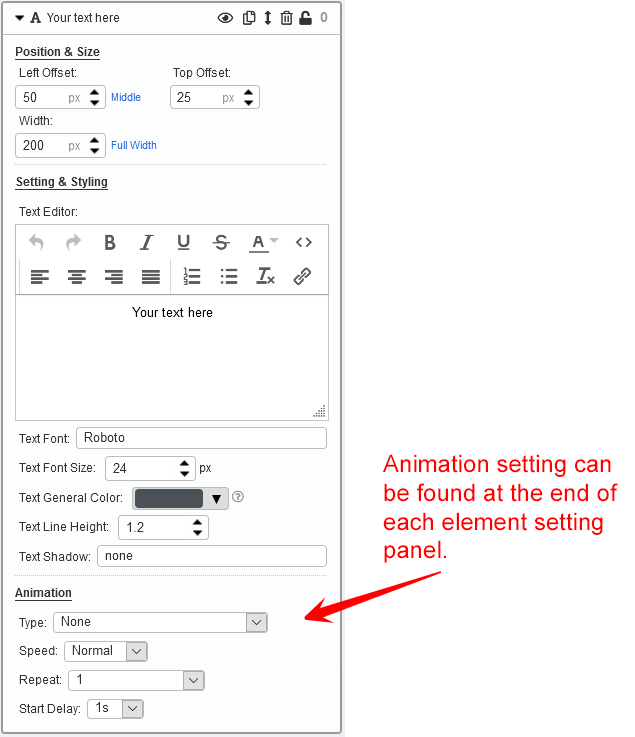
The animation setting can be found at the end of each element setting panel (see screenshot below).

You simply have to select
– animation type,
– speed,
– repeat pattern, and
– start delay.
21 Animation Types
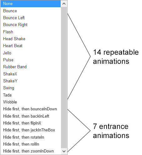
There is a total of 21 animations you can choose from.
14 of them are standard animations that are great for repetition;
7 are entrance animations, i.e. the element will first be hidden on page load, followed by an animated entrance.

Combine Animations Using Delay
You can get creative and combine different animations with delays, and produce an effect like this:

Give it a try. Let me know what you think.
Seems great, will give it try for sure,
Thanks
I love it.Your help is greatly appreciated. Now I am understanding more about animation.
Perfect!! Thanks for everything you provide to us!
Thanks I am trying to understand, it is great.
Cool, thanks :)
How is it that this site just gets better and better? As far as I can tell, it’s the only place on the entire internet that does this; provide new killer benefits almost faster than I can employ them (but not quite! Ha Ha).
LeadsLeap is the polar opposite of site owners who just sit on their hands using the same old features with no improvements.
To steal a bad actor’s famous statement and use it for good is fun, so here it is: LeadsLeap today, LeadsLeap tomorrow, LeadsLeap forever!
Thanks, Kenneth, for always (and I mean always) looking out for your members. You’d win my vote today for the best admin on the planet.
Thanks Edgar. The only way to keep me alive is to have my creative juice flowing. LoL.
I agree Edgar! Very well put!
Hmmm… LeadsLeap, or I should say Kenneth rocks!!!
Not that the page builder is already one of the best ones I have been using, but getting new features regularly to build even better landing and capture pages, makes LeadsLeap an absolute no-brainer to me. Every LeadsLeap member should pay the monthly fee, not only for the traffic and the additional PRO features, but to show Kenneth the appreciation he absolutely deserves for the job he does for us.
I also belive the ad delivery is outstanding. Watching ads myself on LeadsLeap frequently, I can say this place is unique in so many ways and it even makes fun to see how other “marketers” promote their stuff. Hilarious sometimes. One can learn so much from (the mistakes of) others. ;o)
Also, Kenneth is highly responsive and listens to members’ concerns. In fact, I got an immediate response last week (on a Sunday) to a missing feature I found would help me greatly with SendSteed. A few days later, that very feature was added. JUST AMAZING!
Thanks Kenneth!
Kay
Thanks Kay. Looks like you have been using LeadsLeap to the fullest, including the ad system. Yes, one can really learn more from others’ mistakes.
omg thank you soo much can i also add as well can you put in for more landing page design please?? thank you sooo much!!!
The templates in the page builder are actually illustrations of what you can do with the builder.
We can create more designs by simply changing the images and text, but what is the purpose? How many is enough?
Truth is, we do not want members to use the designs without changes. They are just templates that have to be customised.
Nevertheless, if you have any request for a unique template, contact our support. We can build and add it in.
I agree with everyone here. LeadLeap is really all you need to succeed Online. Even if you don’t have a business you can start with the Affiliate program.
Not only do you get all the Tools you need, you get the training to go them and that’s just free members. The benefits to going to Pro are well worth it and the price, Kenneth could charge double, triple or even more for all that he provides for the tools, training and outstanding customer service.
LeadsLeap drops the mic every time.
Thanks Kay
This is a very useful feature, thank you!
Thank You Admin
I just love all these great features! Thank you for this, I love it.
The way the animation is set up, the word ‘Photographer’ is obscured by an image that just happens to be in the right place to blend in with the background.
With Squarespace’s templates and such, that will be quite difficult to accomplish.
It would be simpler to use the “overflow: hidden” css rule on the element containing the text, then hide the text by reducing the width of that element.
Can you contact me via our support ticket system? Let me know the page ID. Then we can look into this issue further.
I’m overwhelmed with what I see on this platform. Cudos
Hi Kenneth
I cannot believe how much value you have put into Leadsleap.
I wonder why everyone that is working online are not a member
of Leadsleap. It is AWESOME the value for
Free members, but I would still say to them
upgraded and get the maximum use out of Leadsleap.
I Will give the animation a try and split test them.
Thank you
Garry Tatnell
You are most welcome, Garry. I’m glad that you appreciate it. Thank you! :)
I am only now beginning to understand about Leads Leap.
This is a magnificent tool once you get to understand how to use
it with the email marketing and traffic etc.
Thank you for the opportunity to test it.
Ricchi Rich