Everything online is becoming mobile-friendly. Blogs, websites, social networks and even Google Adsense.
Now, LeadsLeap Widget is mobile-friendly too.
What does it take to be mobile-friendly?
1) The widget and its content should be able to fit into any window dimension.
2) It should be able to resize dynamically as the window dimension changes.
In other words, the widget has to be responsive. It should be able to change and adapt accordingly.
To show you how our responsive widget works, check out this demo page:
LeadsLeap Responsive Widget Demo
Cool huh?
Other than making the widget responsive, we have also changed the design of the widget.
Below are some of the important changes:
1) New traffic stat to reflect recent ad popularity
Previously we only display the total clicks of an ad. It is cumulative. Hence old members’ ads may have 1000s or 10000s of total clicks. This is helping old members to get more clicks, but it is penalizing new members who have just started.
To better reflect the current popularity of an ad, we’ve added the weekly hits for the ad. Prospects can now have an idea of how popular an ad is recently.
To give you a better idea, here’s a picture showing the difference.
2) A header to let prospects learn more
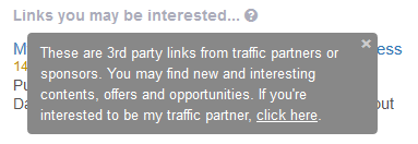
We’ve also added a header with a question-mark icon that people can click to learn more about the widget. Below is the into message that will be shown when someone clicks on the question-mark icon.
The intro message serves two purposes:
– to explain what are the links.
– to encourage your visitors to join you as a traffic partner.
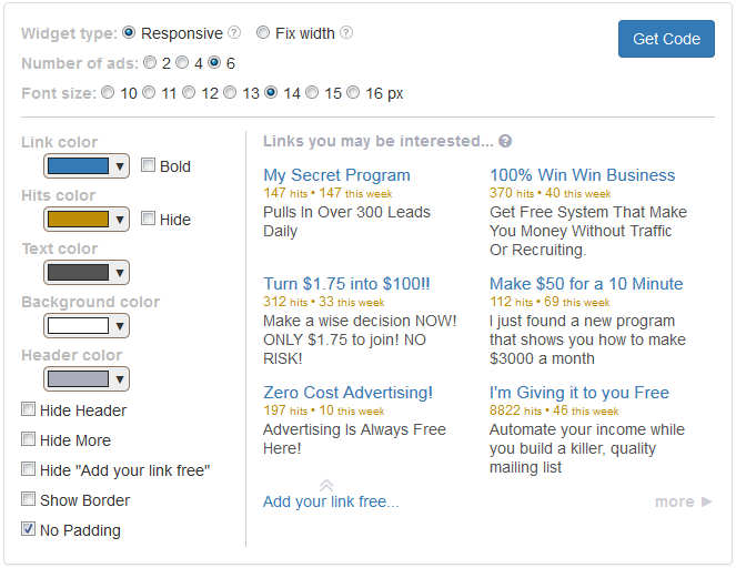
3) You have full control on the look and feel of the widget
The last change that I want to highlight is the widget setup page.
Previously you can only change the color and border settings. Now you have control over almost everything.
Don’t like the traffic stats? Just hide it.
Having a dark background on your website? No problem.
Below is what you will see when you go to the widget setup page now:
What Should You Do Now?
If you have LeadsLeap Widget on your website, take a look at it and see if you like the new look.
Your current widget is NOT responsive. It is based on the width that you’ve chosen last time. The color scheme is also based on the color scheme you’ve selected previously.
If you like the current look, leave it. If you prefer to upgrade it to the new responsive widget, just go to the widget setup page, get the new code and replace the old one.
With the new widget, we are now ready for more exciting development. Look forward to it real soon!


This post is very interesting.
i like LeadsLeap Widget because it is responsive design. thank you very much
Thank you for this. Nice design, and flexible.
Really amazing feature i like to have responsive and mobile friendly version of leads leap widget and it also very use full for other customers. It also increased ROI (Return on Investment) of company.
Most of the people use mobile devices so their is no question about responsive design & development. Its a good news LeadsLeap Widget have been responsive and mobile-friendly.
Now we can easily use this widget on any mobile device & browser.
From today’s trends responsive design is necessary for app or website, Lead widget mobile friendly is helpful for mobile users
As we all know that the importance of responsiveness rapidly increasing and many companies now converting their websites on mobile responsive. I must appreciate the team of LeadsLeap to create responsive widget.
one of the best widget for responsive and mobile friendly website.
I was waiting for it from the past few months. Thanx LeadsLeap Widget to get updated and provides so much flexibility and improvement in the previous version.
Keep sharing the detailed information in the future also.
Thanks for making it responsive.
From today’s styles responsive design is essential for app or website, Lead widget mobile friendly is obliging for mobile operators
From the current patterns approachable structure is essential for application or site, Lead gadget versatile helpful is useful for portable clients
The results of this test is said to have a mobile friendly place. However, with the iPhone, I messed up my website the way of the pull on the desktop to me, doth shew to him all things, and much more than the other.
I have sent to a support ticket. Please reply to that ticket with your website url. We will check it asap.
Yes, Widget is now responsive and mobile-friendly in this time.