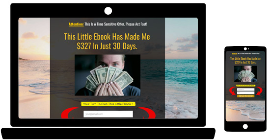
Today’s update is about making your landing page mobile responsive.
Before I go into the updates, I want to briefly touch on how our Page Builder creates mobile responsive pages.
It’s a short refresher course for those who are new to our Page Builder.
How LeadsLeap Page Builder Creates Mobile Responsive Pages
LeadsLeap uses the idea of ‘row‘ and ‘column‘ as the building structure.
A page can have multiple rows.
A row can have 1, 2 or maximum 3 columns.
If a row has 2 or 3 columns, the columns will be collapsible when viewed in mobile phones.
Let me show you some examples.
A row with 1 column looks like this:

The desktop view and mobile view look exactly the same.
A row with 2 columns looks like this:

The columns will collapse on top of each other when viewed in a mobile browser.
More Options For 2-Column Design
If you use a row with 2 columns, you can decide whether the left column will collapse to the top, or the right column will be to the top.
You can also decide whether you want the left column to be wider, or the right column.
All the options are shown below.

Now, that’s where the update comes in.
Previously, you have to make the decision AT THE TIME when you create the row.
If you change your mind, you’ll have to re-do everything again.
That is really a pain!
Now, you can change the column option anytime.
To change how the columns behave, simply mouse over the 2-column row and then mouse over the setting icon. See the demo below.

Please note that this option is only available for 2-column row. For 3-column row, the collapsing will be left on top.
How To Know Which Column Will Collapse To The Top?
To know which column will collapse to the top, we’ve added a ^ to the top column. See the explanation below.

Another way of course is to see the page in mobile view.
Previously, you will have to really view the page using a mobile phone to see the mobile version.
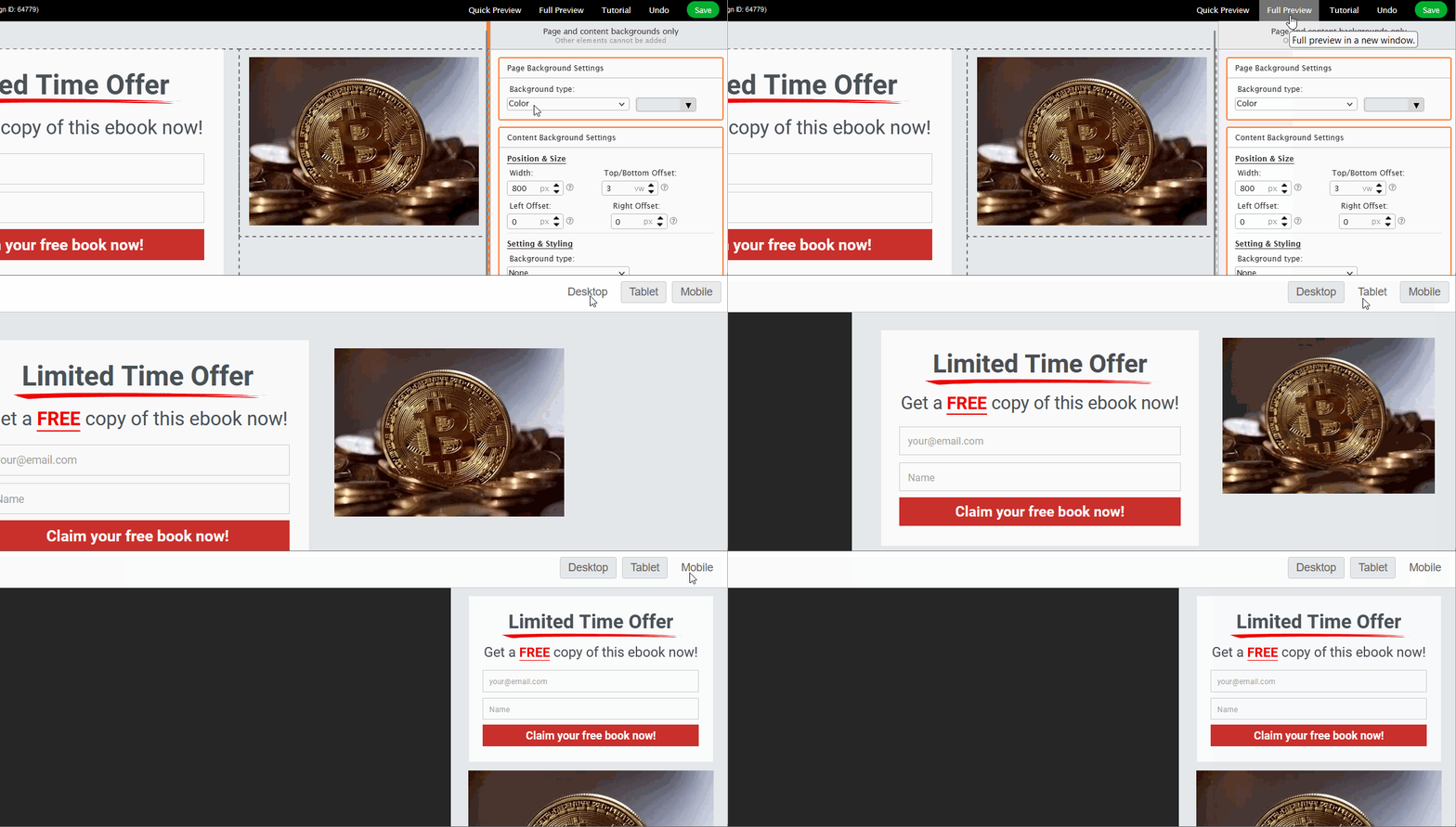
But now, you can preview in mobile mode.
This brings me to the last update…
Preview The Page In Mobile Mode.
When you preview the page, you can view the page in Desktop, Tablet or Mobile mode.
See the demo below

With these updates, it is now easier to create mobile responsive pages.
Brilliant update thanks for this!!
Good update and very informative, thanks,
Cool, will try it asap then. Thanks for these improvements.
Good update and very informative, thanks,
The explanation was understandable thank you.
That is straight up cool. Thanks
Yes
Nice, you are better than the rest!!
Great, I’ll try and play around with this.thank you
It is good update thank you
Very nice
Thank you for that
Cool Stuff. I like LeadsLeap every day a little bit more … smile
Very useful information thanks!!
I like how the pages look very nice.I want to use them now.!
In a word LeadsLeap is Awesome!
Finally the final piece needed for making me a genius at rendering websites in mobile app display…
Great! Thanks for the update.
What if I used a template that only has 1 row and column?
You can add another row with multiple column or start with a different template with multiple column.
Thank you
I’ll give it a go
,
I will try to understand.
So far it is interesting to me, will be interested in seeing more. James
I try to learn sometimes it’s too hard to understand
Great, thanks,
Thank you