We’ve made some important changes to the PopupXpert, your free popup generator.
Please spend some time to read it, especially if you are using this tool.
Even if you haven’t used it, it’s good to keep yourself updated, so that you know what is available for you.
1) 500+ Icons At Your Disposal
Recently we noticed that some WordPress themes automatically change symbols into Emoji. That makes the close button and others symbols look out of alignment.
To solve this problem once and for all, we add the Font Awesome library into the system.
Those of you who are familiar with Font Awesome, you probably are thinking, “‘Yeah!”.
The library consists of 500+ icons that you can add to your design. With our editor, you can easily style these icons to your liking.
You can use these icons as bullets, watermarks or even design images.
Let me quickly run through with you how to add an icon.
Below is a screenshot of the Widget Designer. To add a new icon element, just click the ‘i‘ button. You can then choose from a list of more than 100 icons as shown below:
We’ve only added 100+ commonly used icons for your immediate selection because 500 is really too many!
If you can’t find what you want, just click the ‘More icons’ link to go to Font Awesome website, take down the name of the icon you want to add and manually enter it into the Icon Name field (highlighted in yellow).
2) New Concept For Static Widget
The next change is how we animate Static widgets.
For those who are new to the PopupXpert, there are 4 types of widgets:
- Lightbox
- Slidebar
- Cornerblock
- Static
The first three popups are overlay popups, i.e. they float above the content.
Different from the three, Static widget is fixed at a specific location within the content. Most people add it to the sidebar or at the end of an article.
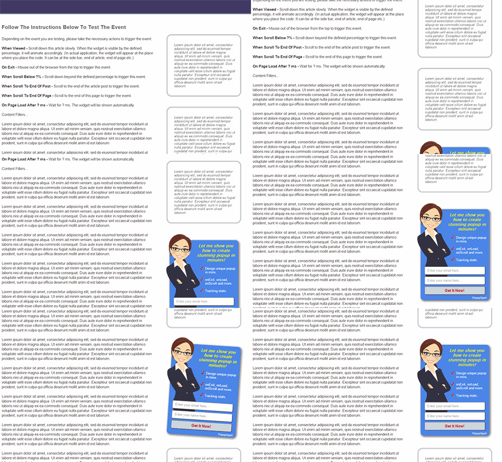
Previously, a Static widget is visible on page load and it will animate when the visitor sees it.
Below is how it worked previous:
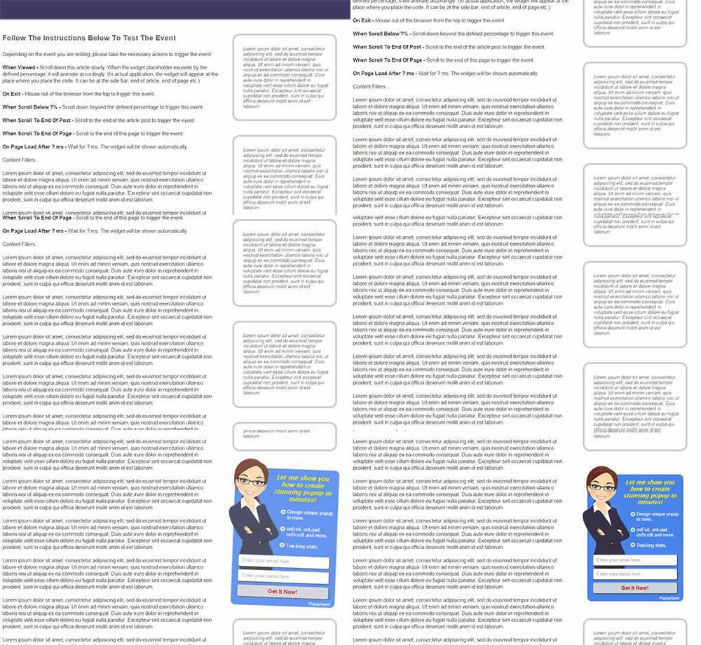
Now, new Static widget is invisible on page load. When the visitor scrolls down, it will make a ‘grand’ appearance.
Here is how it works now:
Why change the concept?
I don’t like the old animations of highlight, vibrate and shake. They are pretty ‘old-schooled’. With css3, there are many new animations we can explore.
Of course, technology aside, the main thing is marketing. I feel that making a grand appearance like the example above will create greater impact. It also makes the animation look more professional. Professionalism = trust, and trust => conversion.
Will It Affect Your Existing Static Popups?
In short, the answer is no. Your existing popups will work as intended. These changes will only affect new popups.
However, should you edit your existing popup, your popup will automatically be upgraded to the new concept.
3) More Animations
We have added some new animations to the system, like the one below.
More are coming in the next few days.
In total, we should have about 10 to 15 animations for you to choose from.
4) The Widget Base Is Now Draggable
The last update is on productivity.
When designing the widget, the widget was previously fixed at the center of the screen. It may be blocked by the Widget Designer.
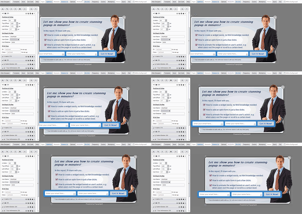
Now we made the widget base draggable. You can now move the entire widget around while designing.
The dragging handle is at the top and bottom of the widget base.
5) Step By Step Guide Added
Last but not least, we’ve added a step by step guide on how to use the PopupXpert.
We have been adding features after features these few months and have been lagging in our documentation. My apologies.
We are catching up on that, starting from the PopupXpert.
If you go to the PopupXpert Manager, you will see the button to access the step by step guide.
The guide may look lengthy but you just have follow it once to create your first popup widget. You should get the hang of it after that.
By the way, do you know that the PopupXpert system is the most complex system in LeadsLeap? It’s even more complex than the LeadsLeap system itself!
If you want a tool that comes with standard inflexible templates, there are plenty. But if you want full control over your design, using a simple and coding-free editor, PopupXpert is probably the only one in the market. And it’s free!


The new changes sound great, although I have to say that I personally find popups annoying. However, with the amount of control you have using PopupXpert, such as the capability to delay the form to appear at a specific moment during a users visit, makes PopupXpert comparable to some of the premium options available, and for free too – now that’s crazy!!!
– Thanks Kenneth.
Great to see that someone is trying to fix those issues which are now facing by every WordPress user. Popupxpert is really a great tool to get leads as this popup at the right time so that visitors can see and attract towards the offer. Really a great tool. well done.
Thanks Kenneth
I managed to build two pop-ups within 30 minutes. The interface is intuitive and asy to grasp. Thank you for anothr excellent tool. Best regards Pete
Thank you Kenneth for all these free stuff you provide this is one of the most awesome website online. Please keep up the good work and I wish you all the best for years to come.
PopupXpert is definitely a tool that I will leverage on to build my email list. Thank you very much.
On my first try, I can feel that it is already easy to use.
It is my pleasure that i got some useful tips from website of yours and i am going to share with my friends which has make some traffic for me through these pop ups.
You should actually write this kind of posts more often, its very informative and professional. I can now say that the importance changes made to popupxpert are now well known to me. Great
Why not try to post this kind of information more often? Its a very interesting blog, talking about an issue that many would be interested in. Keep up
Great post, thanks for this